Themes
Add Theme to Fumadocs UI
Usage
Initialize Tailwind CSS on your Fumadocs app:
Preflight Changes
By using the Tailwind CSS plugin, or the pre-built stylesheet, your default border, text and background colors will be changed.
Light/Dark Modes
Fumadocs supports light/dark modes with next-themes, it is included in Root Provider.
See Root Provider to learn more.
RTL Layout
RTL (Right-to-left) layout is supported.
To enable RTL, set the dir prop to rtl in body and root provider (required for Radix UI).
Prefix
Fumadocs UI has its own colors, animations, and utilities.
By default, it adds a fd- prefix to avoid conflicts with Shadcn UI or your own CSS variables.
You can use them without the prefix by adding some aliases:
Navbar Height
When the default navbar is replaced, the layout may overlap with your new navbar.
You should set the --fd-nav-height variable to the height of your navbar.
You can use it with CSS media queries for responsive design.
Layout Width
Customise the max width of docs layout with CSS Variables.
Colors
The design system was inspired by Shadcn UI, you can easily customize the colors using CSS variables.
Tailwind CSS Preset
The Tailwind CSS preset introduces new colors and extra utilities including fd-steps.
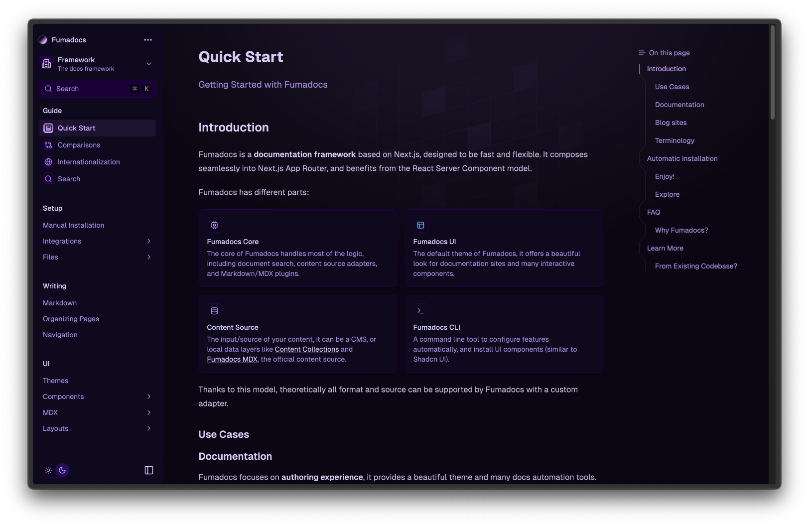
Themes
It comes with many themes out-of-the-box, you can pick one you prefer.
neutral
black
vitepress
dusk
catppuccin
ocean
purple
Typography
We have a built-in plugin forked from Tailwind CSS Typography.
The plugin adds a prose class and variants to customise it.
The plugin works with and only with Fumadocs UI's MDX components, it may conflict with @tailwindcss/typography.
If you need to use @tailwindcss/typography over the default plugin, set a class name option to avoid conflicts.
Last updated on